Simple Serenity
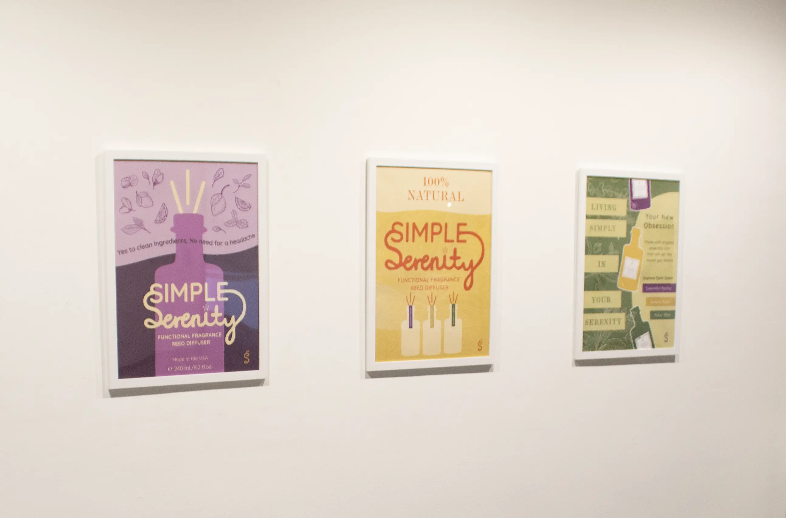
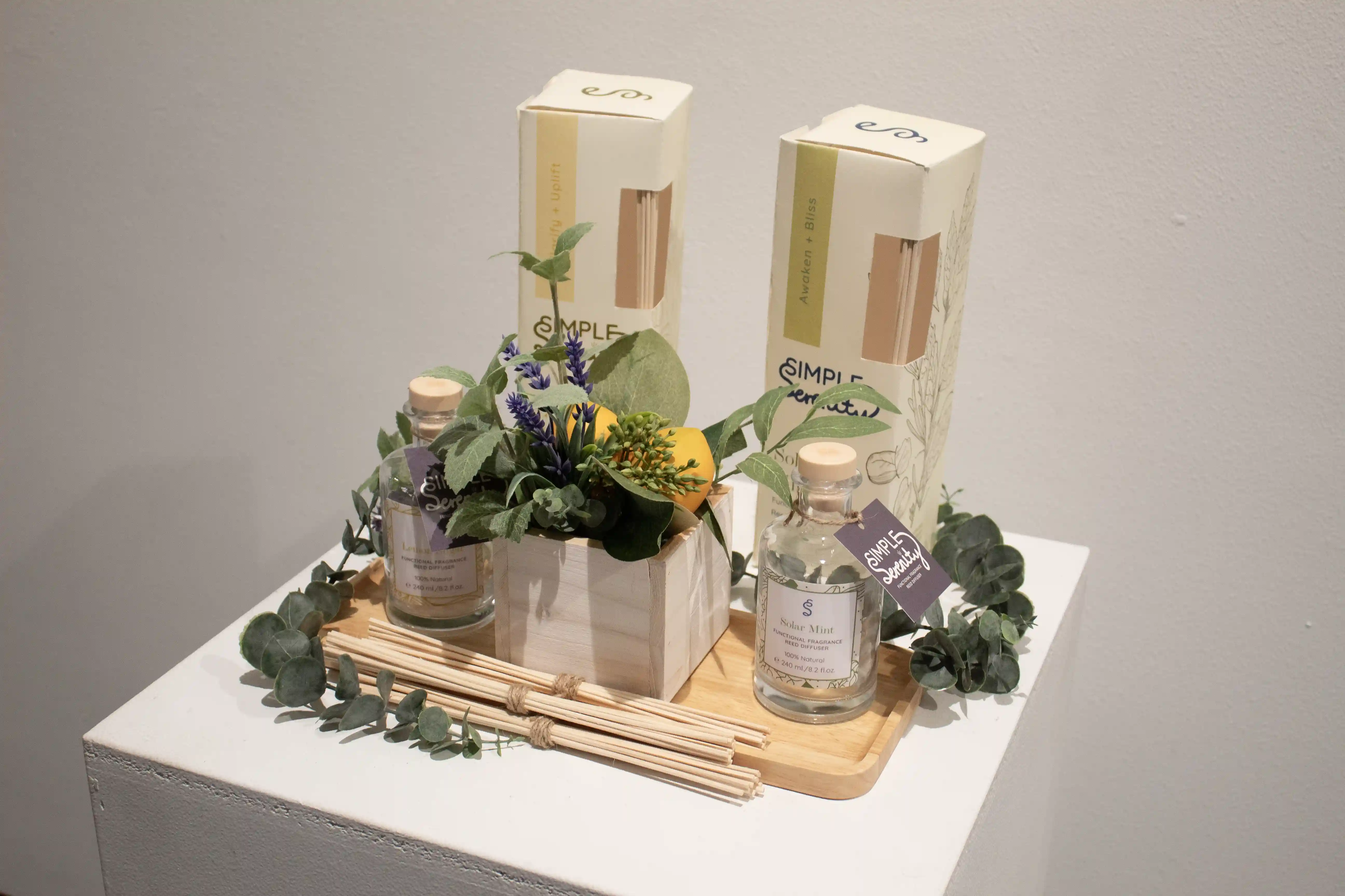
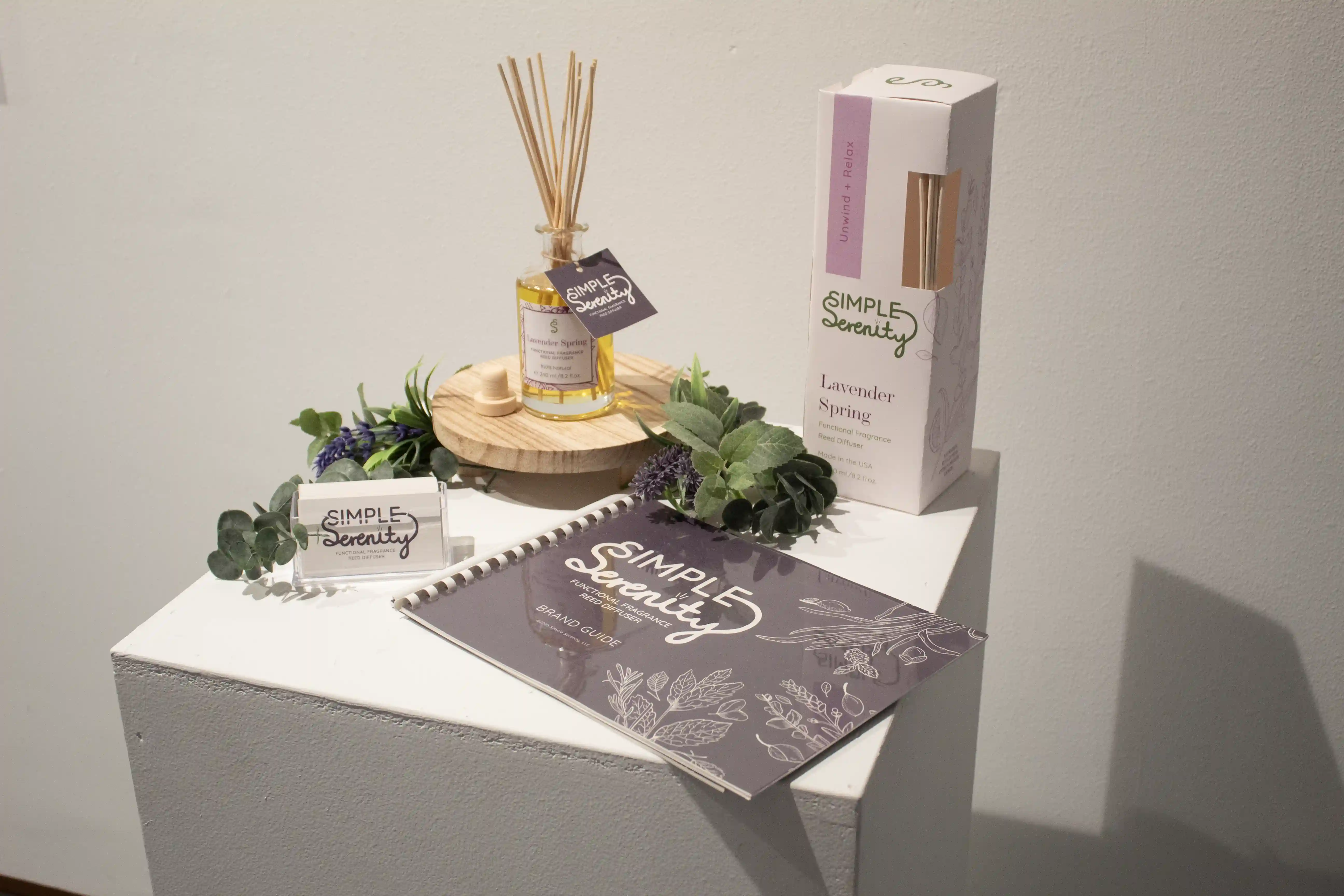
Simple Serenity is a brand identity thesis project for a fictional home fragrance company specializing in reed diffusers. The brand explores messaging, visual language, and real-world applications to create a cohesive and purposeful identity. Graphic Design plays a key role in shaping the brand’s layout, craft, and visual storytelling. The project includes three advertisement posters, a set of reed diffusers with packaging, brand accessories, a social media campaign, and a comprehensive brand guide. The visual identity combines soft, harmonious hues with vibrant contrast to evoke calm and balance. Delicate fruit and floral illustrations interact fluidly with typography across packaging and promotional materials, adding a warm, personal touch.
Core design principles are used throughout to ensure consistency and cohesion. Simple Serenity is grounded in promoting clean-ingredient products and raising awareness about their benefits for individuals and families. The use of essential oils is thoughtfully integrated to enhance sensory well-being, reflecting the brand’s holistic approach. At its core, Simple Serenity is a brand with purpose, demonstrating how intentional design and scent can work together to support health and emotional balance.
-Alicia A. Lawal